

A beautiful visual has never saved a weak message
Many brands still confuse visual impact and advertising impact. Yet, a strong visual with an ordinary idea rarely creates anything more than an aesthetic moment. By contrast, a clear, memorable, well-told idea can survive a much simpler execution. In 2026, the real lesson is this: storytelling carries the message; the visual serves it.
What we remember from an ad is not always the image
We rarely remember an ad just because it was “beautiful”. We remember a character, a line, a tone, a running gag, a jingle, or a narrative tension. That is exactly what campaigns that stand the test of time prove: they give people something to recognise, repeat or retell. The visual helps, but memory mostly sticks to the idea.
Mike at RONA: a character is sometimes worth more than art direction
RONA didn’t just launch a campaign. The brand created a cultural reference point. According to the Media Innovation Awards, “Mike at RONA” quickly became an instantly recognisable ambassador in Quebec, to the point of dominating the airwaves and embedding itself in the public imagination. What stands out here isn’t a sophisticated visual. It’s a character that is simple, coherent and endlessly reusable.
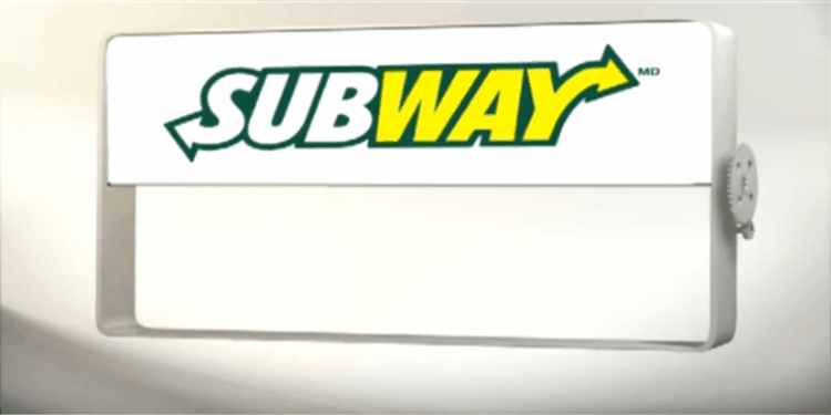
A simple jingle can do more than a polished ad
Subway’s “12 inches, $5” is a good reminder. This wasn’t a high-end craft demo. It was a memorability engine. A rhythmic phrase, repeatable, impossible to forget. When a brand finds the right audio hook, it buys itself a place in people’s heads long after the ad ends.
Emotion often beats aesthetics
The Lait du Québec campaigns also show the power of an engaging story. Their most recent campaign leans on a family story, the passing down of traditions, and attachment to roots; that’s precisely the emotional register that gets people talking and builds buy-in. When the story lands, the public is no longer just consuming an ad: they’re stepping into a point of view.
Even humour is first and foremost a narrative mechanism
Maxi is a good example of a brand that understands that a memorable ad doesn’t need to be prestigious, just clear and easy to tell. Its recurring use of humour and popular figures like Martin Matte creates continuity that the public quickly recognises. The joke becomes a brand structure.
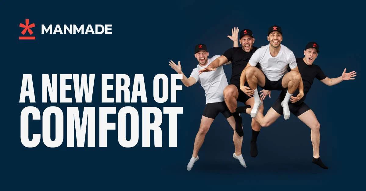
The “ugly ads” prove the same point
Brands like Manmade show that a raw, direct, social-first tone can perform very well when the idea behind it is strong. Campaign Canada describes the brand as highly social-focused, with its founders as ambassadors; after its Super Bowl appearance, Manmade reported a sharp increase in sales, traffic and engagement. The signal is clear: less polished content can win if it tells something distinctive.
Visual still matters, but it comes after
Of course, when great storytelling meets great visuals, the result gets elevated. But order matters. If the foundation is empty, execution won’t make up for it. In 2026, the brands that will stand out won’t be the ones that look the best. They’ll be the ones that know best what to tell, how to tell it, and why their audience should remember it.
If you remove the beautiful image from your next campaign, is there still an idea strong enough for people to remember it?


Let's stay in touch.
Learn more about high-performance web design. Follow us on Instagram.
